
Ink Station
Redesigning the e-commerce experience
Overview
Ink Station began a redesign of its e-commerce platform with the vision of expanding the product categories and becoming the biggest e-commerce for office supplies in Australia. The goal of the project was to improve the overall experience across the platform and increase sales.
Background
Ink Station is an Australia-Based e-commerce company, focusing on offering the best value of ink and toner cartridges on both B2B and B2C through their self-developed platform. I joined Ink Station as a sole UX/UI designer in Apr 2019. At that time the platform had been built over 12 years ago and I had to work with the development team led by a product manager to redesign the platform.
The Brief
As 99% of sales are coming from online, the primary goal of this project was straight forward.
How might we increase the sales by improving the conversions across the platform?
With this in mind, I worked with the product manager and tried to gather more insights and requirements from the stakeholders. We determined the key objectives are:
Increase conversions.
Improve the usability across the platform.
Reduce abandoned carts.
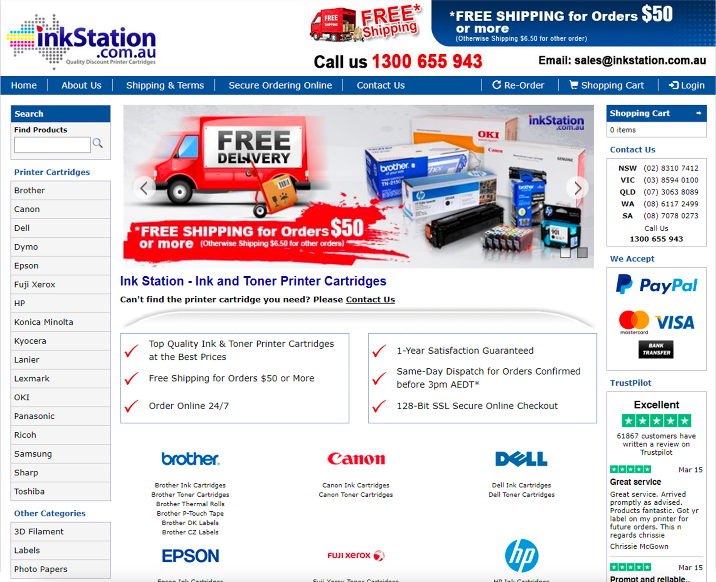
The homepage before redesign
Unboxing the Problem
As the website was developed a long time ago, the interfaces across the platform were not user-friendly from my preliminary review. To uncover the pain points that our users are experiencing with our platform, we’ve conducted user interviews and observed the recordings of on Hotjar (a behaviour analytic tool) to know more about our users behaviours.
User Interviews
The research interviews included 3 categories of our primary customers:
Returning Customers (repeated purchase regularly)
New Customer (with 1 order recently)
Business Customer (placed orders for business)
User Observations
In the user recordings, we saw many users perform multiple searches in a row before clicking to a product, indicating they weren’t finding what they were looking for initially. They also spent a lot of time scrolling up and down the product listing pages. They were likely looking for a particular product and in some cases they couldn’t find it.
Another interesting point was, some users appeared to be confused by the distinction of ink and toner. They would know their brand and printer model but wouldn’t be sure if they should be looking for ink or toner.
Conclusions
After the interviews and watching over hundreds of recordings, we’ve summarised 2 key issues:
Searching for products was a headache. Customers usually have particular products in mind when they come to our platform. They will start by searching the cartridge model or printer model which either should lead them to the products. However, let alone the search box is hardly to find on the they often landed on the search result page with no results found, even if the products were on our database. Most customers dropped out when they couldn’t search for the right products.
Obstacles at checkout. There were a few factors that we’ve gathered about the checkout process. Since all customers need to login or create an account before they continue to checkout. It blocked out when new customers were reluctant to register or returning customers had troubles remembering the password. It also needed customers to fill in the address first when they were creating an account.
Refining the problem statement:
How might we guide the users to find the right products efficiently and effectively?
How might we simplify the checkout process and retain customers until they successfully placed an order?
Designing the Solutions
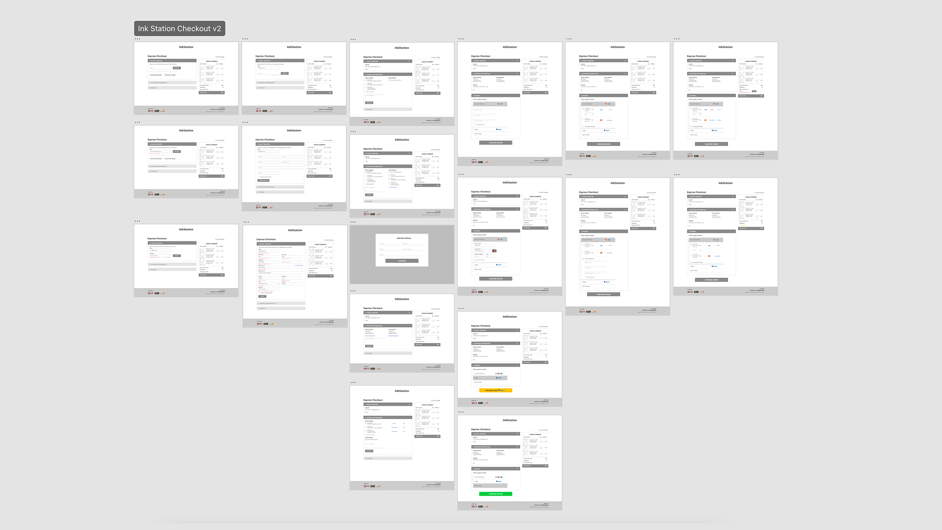
After consolidating the insights, I started to develop wireframes and clickable prototypes so that our team could discuss and validate the design in an agile environment.
Improve the efficacy of search
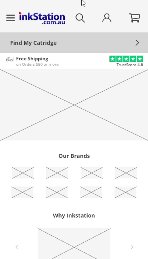
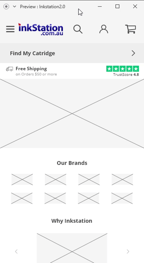
Make the search prominent. Firstly, the search should be always visible to users across all pages, so I’ve redesigned the header which contains the search bar and other important information such as free shipping message, reviews and cart summary. The search should be prominent and easy to find.
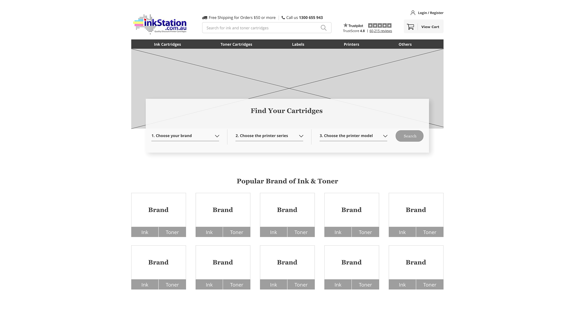
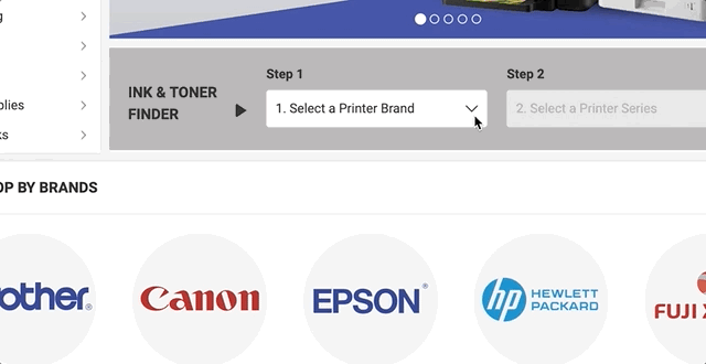
Introducing Cartridge Finder. Since some users were confused between Ink and Toner, the navigation might be not very helpful for them to find the right product. However, based on one of our use case from the persona, users could get information like the printer’s brand, the printer series and model number with the presence of the printer. The cartridge finder was designed to guide the user to find the right cartridge step by step without knowing if it’s ink or toner.
Provide keyword suggestions. We’ve also done a thorough investigation in the backend and realised the search was case and wording sensitive. Users have to search for the exact wordings to get the product results.
For example, when users search ‘tn2250’ for the Brother TN-2250 Compatible Toner, they couldn’t find it because of the low cases and missing the ‘-’. This caused frustrations for our customers who hate to waste time.
To get this right, we will need to improve the accuracy and efficiency of the search. Take Google as an example, if we could match what user is typing with the keywords in our database and provide suggestions could be reducing the searching time. The user should also be able to see the search history under the same cookie.
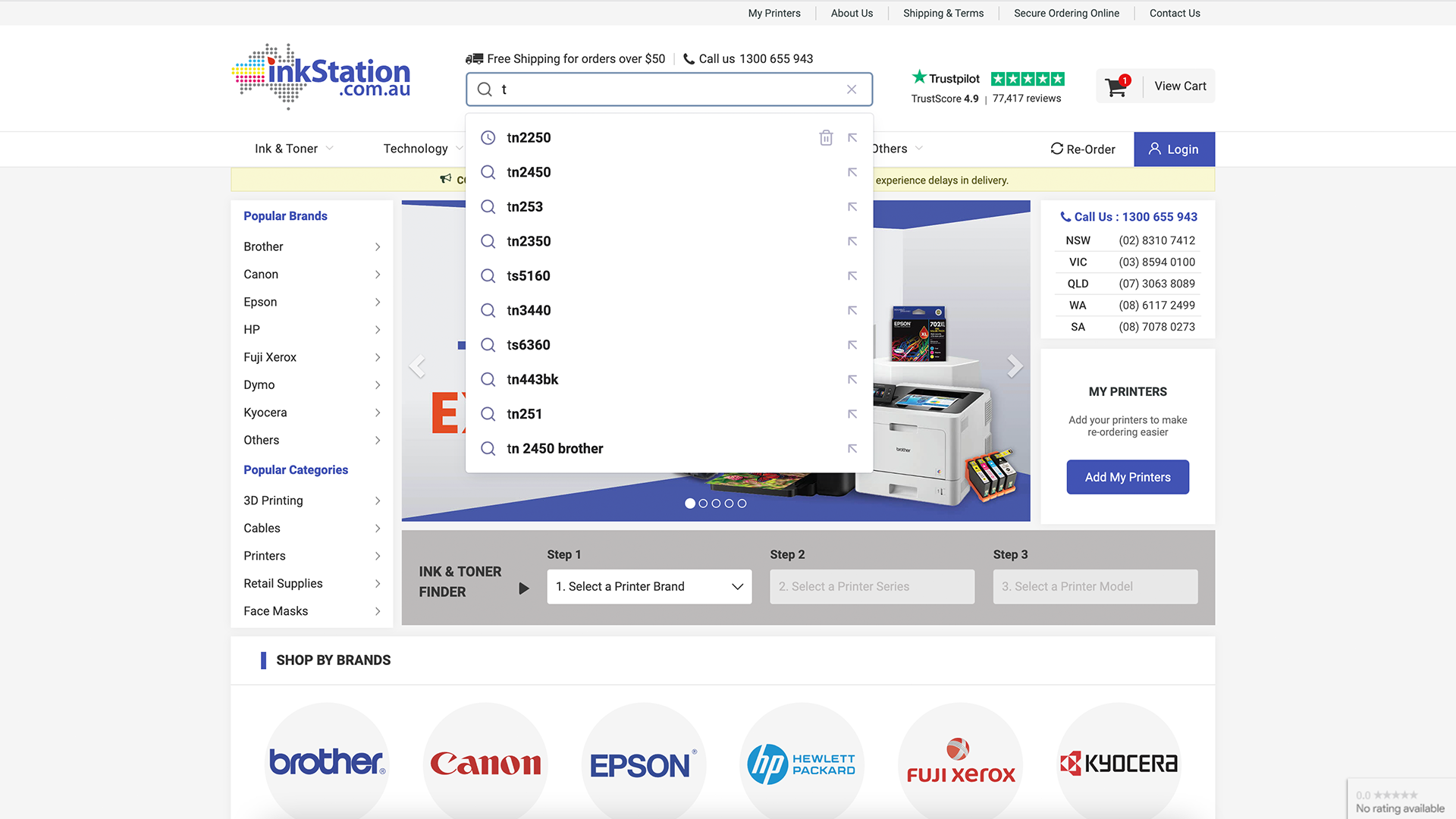
For mobile, the search bar was designed to be full screen and focused when user interact with the search button.
Redesign the checkout experience
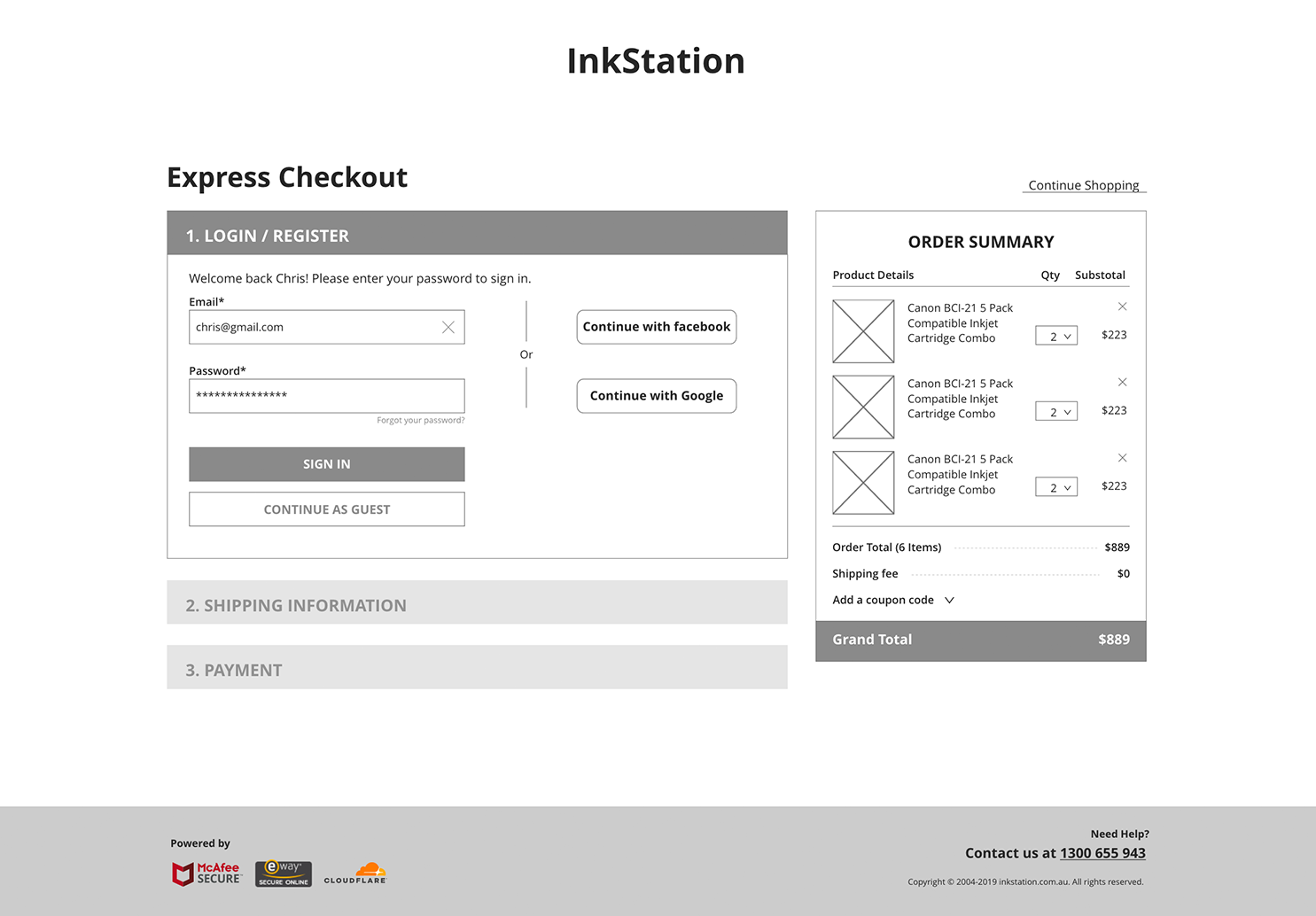
Another pain point from the user was definitely the experience with the checkout. Since it was compulsory for a customer to login or register an account before checkout, they were distracted and increased the chances to drop out of the session.
It is very important that the customers know what they are doing and feel controllable during the checkout process. I’ve suggested a design and some tools that only focused on checkout but nothing else. We took out the header or any buttons that might confuse and distract the customer. We separated the checkout into 3 steps so the users are guided step by step without overwhelmed by a lot of informations required to fill in.
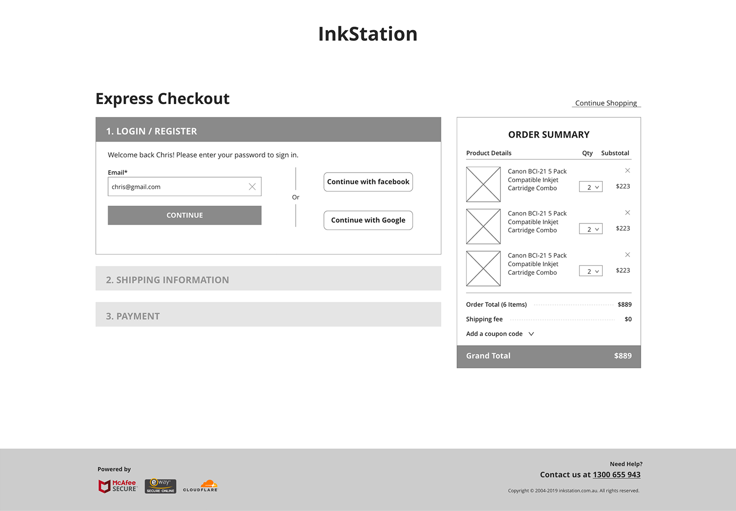
We’ve also implemented a guest checkout design, customers can always continue to checkout with or without login. In this design, we aimed to reduce all frictions that the customers might have so that they could place an order seamlessly.
Testing and Iterations
After the development, I performed the usability testing to ensure the layouts and new functions were ready for live traffic. The design is now 100% on live but our team have been A/B testing and monitoring the design if there are any issues from the users’ point of view. We’re still working on iterations for improvements.
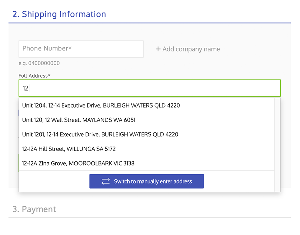
Implementing Address Finder
To further shorten the time spent on the checkout, we’ve A/B tested the address finder and found it could improve the conversion rate significantly. In addition, it could also reduce the typo result in logistic errors.
The address suggestions would be refined as typing. If users couldn’t find their address, they could still input the address manually.
If users are logged in, they can choose from the list of the addresses saved in their account without entering it again.
Adding Search to Cartridge Finder
It could be a long list when opening up the dropdown for brands in the cartridge finder. Adding a search functions in the dropdown help users to find what they need without scrolling up and down.
When users click on the dropdown, it will auto focused on the search bar and they can start typing right away. Same implementation goes to step 2 and 3 as well.
Key Takeaway
Since the implementation of the header and all the iterations afterwards, we have seen huge improvements on users searching products and the conversion rate has been significantly increased. In addition, I have also received positive feedback from the customer service team about saving their time to take orders for customers.
To summarise the key take aways from this project:
Focus on what matters. There could be a lot to consider when designing a solution and easily get distracted, so it is important to keep in mind that solving the user’s main problem would be the primary focus. Always come back to the problem and the ‘why’.
Get feedback ASAP. It could be very helpful to get some feedback on early stage of the design. It doesn’t have to be perfect before pushing it for A/B testing or involves the internal team including developers to validate the design. Knowing what works and what doesn’t work could help on later design iterations.
Iteration never ends. The design iterations is a constant process. There are always more improvements for your users and the design has to keep evolving with the best practices.